CASE
Purple is the new green: how Space Doctors impacted Ocado’s brand refresh
Space Doctors worked with the Ocado team to set a new course for their visual design, towards something distinct, vibrant and long-lasting.


This case was originally published by our partner, Space Doctors. By bringing a unique blend of expertise in cultural and semiotic insight to Human8, they help brands connect and respond to cultural change.
How it started
The UK’s largest online grocer, Ocado, has long been known for its extensive selection of quality groceries. However, over time, its visual identity began to lose its vibrancy. With digital spaces demanding more of a brand’s visual identity, Ocado needed a refresh. It was vital for Ocado to make a memorable impact in these digital realms and ensure that every customer interaction was meaningful and well-received. The goal for Space Doctors: to explore how Ocado’s visual world could evolve to become more potent and impactful.
How we inspired change
Using semiotics and cultural insight to first understand the emergent category and cultural contexts as well as the place Ocado held within them, Space Doctors delved into Ocado’s colour palette to reinvigorate its brand identity. The previous green and charcoal colour scheme felt too serious, risking an impersonal and emotionless impression. The muted colours clashed with the vitality and variety of choice Ocado is known for. The team sought a new energetic identity that not only evoked a fresh new vibrancy, but that was also ownable for Ocado.
It was clear that shape and form would also be vital in evoking a sense of dynamism and opportunity. The brand’s organic shapes were strong, but with screens shrinking, they needed to be more distinct. We considered how the Ocado swirl and wordmark could be tweaked to stand out and enhance recognition.
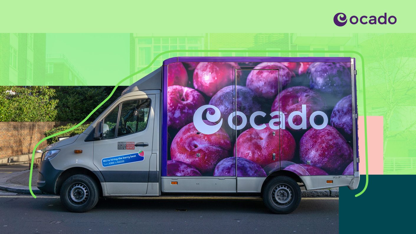
The team decided to swap the green for grape, a distinctive and ownable presence.
How it lives on
The resulting redesign shows Ocado having evolved. It feels emergent, bright, fresh and distinct – and robust enough to remain so into the future.
This work also made way for subsequent redesigns of the iconic Ocado delivery vans as well as a complete overhaul of their private label packaging. Both of which Space Doctors consulted on with the design agency, JKR.
“Space Doctors’ contribution has been invaluable. Our teams across Marketing, Merchandising, Insights and Creative all value the rich and wide ranging culturally-informed category insight, through to the granular analysis we’ve done on our visual and packaging identity, fleet design and value messaging. Our relationship with Space Doctors has helped us stretch our thinking, shape successful creative briefs and carve out new opportunities.”
Ready to do what matters?
Let’s connect